Financial Dashboard
What is it?
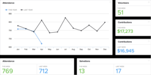
A dashboard is a financial reporting tool used for quick visual comparative analysis of key performance indicator data, often in the form of a series of side-by-side trend diagrams. Dashboards can distill a great deal of data on and visually summarize a wide variety of results on a single page.
What might you want to consider putting on your church dashboard?
- Giving Trend Report This Year vs Last Year (Line Chart) By Week or By Month (or Both)
- Average Weekly Attendance Report
- Monthly Giving as a Percent of Monthly Giving Budget
- Monthly Spending as a Percent of Monthly Spending Budget
- Average Giving Per Unit. Some churches define a “Unit” as (Total Attendance – Children/2)
So then take (Total Giving/Units this week) = Average Giving Per Unit
This is a measure of how healthy the church is and you would keep track of this as a trend line during the year.
- And while there is often differences of opinion about whether or not a Pastor should see individual giving (which we will discuss in a future blog), it is probably important for a Pastor to know if a particular family’s giving changes by perhaps 15%+ as this may be indicative of issues in their life.
How do you prepare a dashboard?
Data that would be used to create the trend charts, bar charts or pie charts would be maintained on Excel spreadsheets where you could easily create the chart as well. There is also a free app at www.churchmetrics.com that you may find viable. Then you would copy and paste the current chart to the current dashboard.